
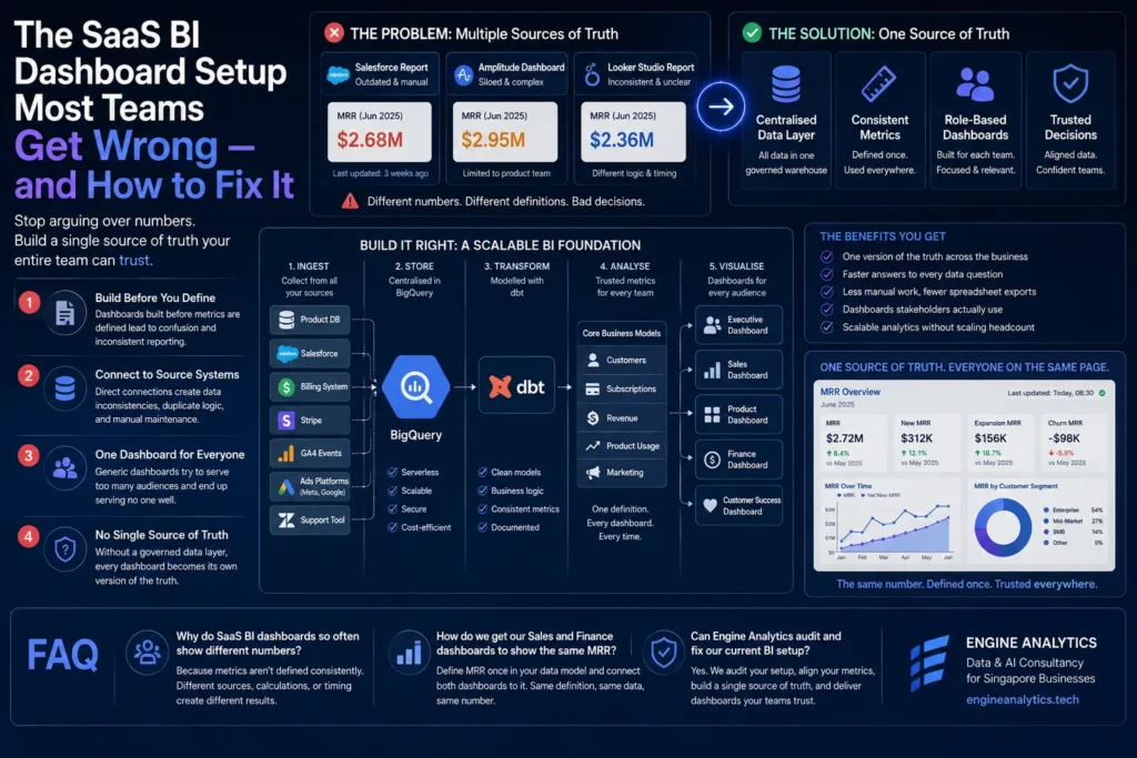
A Singapore SaaS business with sixty employees has three BI dashboards. One is owned by the head of sales, built in Salesforce reports, updated when someone remembers to update it. One is owned by the product team, built in Amplitude, showing feature usage metrics that no one outside the product team fully understands. And one is a BigQuery-connected Looker Studio report that the CFO built six months ago to track MRR, which currently shows a number that is twelve percent lower than the Salesforce dashboard shows for the same month.
When the CEO asks for a single view of revenue performance in the Monday leadership meeting, one person quotes the Looker number, another quotes the Salesforce number, and the next fifteen minutes are spent trying to understand why they are different. Nobody can explain it clearly. The meeting moves on. Both numbers continue to be used by different people for different purposes, producing decisions that are made from different starting points.
This is not an unusual situation. It is, in fact, the most common state of BI reporting in SaaS businesses that have grown past thirty or forty people without making a deliberate decision about how their analytics layer should be structured. The dashboards exist. They are just set up in ways that guarantee the outcome described above: multiple sources of truth, undefined metrics, and reports that nobody fully trusts. This article covers the specific mistakes that produce this state and what a setup that actually works looks like. It draws on the approach used by Engine Analytics, a data and AI consultancy in Singapore that builds BI infrastructure for SaaS businesses across growth and enterprise stages.
The single most common BI setup mistake is building a dashboard before agreeing on what the metrics it shows actually mean. Revenue is the clearest example. In a SaaS business, “revenue” could mean bookings, billed revenue, recognised revenue, or cash collected — four different numbers that move differently and matter to different stakeholders for different reasons. MRR could include or exclude free trials, one-time charges, setup fees, or discounts. Churn could be calculated on a logo basis, a revenue basis, or a seat basis, and the window for measuring it — are customers who cancel mid-month counted in that month or the next? — produces different numbers depending on what was decided.
Dashboards built before these definitions are agreed produce numbers that are technically computed but conceptually undefined. Different people read them differently, and the metric means whatever the reader assumes it means. When two people quote the same metric name but arrive at different numbers, it is almost always because they are using different definitions that neither of them has stated explicitly. The dashboard did not cause the disagreement — the undefined metric did.
The fix is a metrics document that exists independently of any dashboard and defines, precisely and without ambiguity, every metric the business tracks: what it includes, what it excludes, how it is calculated, and who owns the definition. This document should be agreed across revenue, finance, and product before any dashboard is built or rebuilt. The principles of data-driven decision-making and why this alignment matters are covered in more depth in the article on data-driven decision-making with business intelligence.
The second most common mistake is connecting BI dashboards directly to production databases, CRM exports, or billing system APIs and reading from those sources directly. This approach is fast to set up — there is no intermediate layer to build, and the data is current at the point of the last sync — but it creates several structural problems that become increasingly damaging as the business grows.
Direct source connections produce inconsistent results when the same metric is queried at different times. A revenue query run at 9am may produce a different result than the same query run at 11am because a billing event was processed in between. Without a layer that snapshots data at a consistent point, the dashboard’s numbers are a function of when the query ran, not of what actually happened in the period being measured. This is the most common cause of the “why is this number different from yesterday?” conversation that happens in analytics meetings across SaaS businesses.
Direct connections also mean that the transformation logic — the SQL or calculation that turns raw billing records into MRR, or raw product events into active user rates — lives inside the BI tool, repeated in every dashboard that uses those metrics. When the calculation changes, every dashboard that contains it needs to be updated individually. When a new dashboard is built by someone who was not involved in writing the original calculation, it is written slightly differently, producing a metric that is similar but not identical to the others. This is how you end up with three different MRR numbers for the same month.
The instinct to build a single “company dashboard” that shows everything to everyone is understandable. Leadership wants visibility. The dashboard should provide it. But a single dashboard built for multiple audiences inevitably makes a trade-off that serves none of them well: either it is too high-level to be useful for operational decisions, or it contains so much detail that the signal the leadership team needs is buried in metrics that are irrelevant to them.
The head of sales needs a dashboard focused on pipeline, conversion rates by stage, deal velocity, and attainment against target. The product manager needs feature adoption rates, activation cohorts, and engagement depth by user segment. The CFO needs MRR waterfall, recognised revenue, CAC, and unit economics by cohort. Building a single dashboard that tries to present all of these simultaneously produces something that is used by no one because it is designed for everyone.
The right structure is multiple audience-specific dashboards, each built around the questions a specific role actually needs to answer, all reading from the same underlying data layer where metric definitions are consistent. This way, the head of sales and the CFO can both see MRR — defined identically — in the context of the other metrics relevant to their role, without either of them wading through information that is not relevant to their decisions.
All three mistakes above have a common cause: there is no single, governed analytical layer underneath the dashboards where data is cleaned, standardised, and modelled before any dashboard reads from it. Without this layer, every dashboard is effectively its own data environment — with its own connections, its own transformation logic, and its own implicit metric definitions. The piece on data engineering for business leaders covers what this layer looks like and why it is the foundation that makes everything above it trustworthy. For a SaaS business specifically, this layer typically includes a central data warehouse — BigQuery is the most common choice — where data from the CRM, billing system, product database, and any other relevant source is landed on a consistent schedule, cleaned, and modelled into the business-logic tables that dashboards read from.
With this layer in place, metric definitions live in the data model rather than in dashboard calculations. MRR is defined once, in a table that every dashboard queries. When the definition changes, it changes in one place and propagates to every dashboard automatically. New dashboards are built against the same tables, so a new team member building a product dashboard for the first time uses the same MRR definition as the CFO’s finance view. The multiple-source-of-truth problem is structurally impossible when there is only one source.
The setup that works begins with metric alignment: a documented, agreed definition for every metric the business tracks, owned by the relevant function and reviewed when business logic changes. This document is a prerequisite for any dashboard work, not a deliverable produced after the dashboards are built.
A central data layer is built and maintained separately from the dashboards that read from it. Source data lands in a cloud warehouse on a defined schedule. Transformation models run against that raw data and produce clean, labelled, business-logic tables. Monitoring alerts when pipeline failures occur or when data freshness falls outside expected windows. The data layer is owned and maintained as infrastructure — not as a byproduct of dashboard work.
Audience-specific dashboards are built on top of the data layer, each focused on the questions a specific role needs to answer. They are connected to the warehouse, not to source systems directly, so they read from data that is consistent, snapshotted at the right time, and defined identically across every view. For teams with time-sensitive operational metrics, the architecture may extend to near-real-time data movement — the piece on real-time analytics covers when that investment is justified and what it requires.
If your current BI environment produces numbers that different people quote differently, dashboards that nobody fully trusts, or reports that raise more questions than they answer, the path forward starts with the data layer and the metric definitions — not with a new dashboard design. View our data and AI services, explore our engagement plans, see what we have built in our project portfolio, or get in touch and we can assess your current setup and identify exactly where the BI environment needs to be rebuilt to produce reporting your team can trust.
Engine Analytics is a data analytics company in Singapore that builds the analytical foundations — data layers, metric definitions, and audience-specific dashboards — that SaaS teams need to move from conflicting reports to a single version of the truth.
Because the metric is not defined consistently across dashboards. Each dashboard applies its own calculation logic, reads from a different source at a different point in time, or makes different assumptions about what to include and exclude. The fix is a single metric definition layer in a central data warehouse that every dashboard reads from — so the definition lives once and applies everywhere.
Define MRR once in a central data model — what it includes, what it excludes, how trials and discounts are handled — and connect both dashboards to that model rather than to the CRM and billing system separately. When both dashboards read from the same table using the same definition, they produce the same number. The disagreement is a data layer problem, not a dashboard design problem.
Yes. We assess your current dashboard architecture, identify where metric definitions conflict, map your data sources, and rebuild the analytical layer — data models, consistent metric definitions, and audience-specific dashboards connected to a single source of truth. Get in touch via the Engine Analytics contact page to start with a BI audit.
— Engine Analytics | Singapore’s data and AI consultancy — building the single source of truth that SaaS teams need to stop debating which dashboard is right and start making decisions from data they trust.
